
Note: Currently I am using this button so you the reader know the level of AI used in my articles. For more information – go here: What’s with the AI button?
Data Wrangler has been available for awhile now, but I’ll be honest, it’s not something we’ve been actively using. We’ve been heads down on time-sensitive projects for over a year and needless to say, our cup runneth over. Recently we’ve had a bit of respite and I decided to see how we could use Data Wrangler within the context of our current Microsoft Fabric data warehouse (i.e. medallion layer lakehouses).
Data Wrangler has a lot of cool features that will give you code snippets for what you want to do, but I wanted to use it a different way. I wanted to have an easy way to do a quick check for dimension tables. I also wanted an easy-peasy way for others, some of whom are not developers, to be able to do quick sanity check of the data.
Enter the “Developer check notebook”. This notebook may have the smallest amount of code you’ve ever used. (Though you can certainly make it larger and add on to it.) There are more characters in the explanation section (because I make a copy of this notebook for each person – some who may not be coders), then actual code. The purpose of this notebook is really just to get the dimension table into Data Wrangler, so I just pop it in a data frame (sometimes several tables so I easily test related tables.)
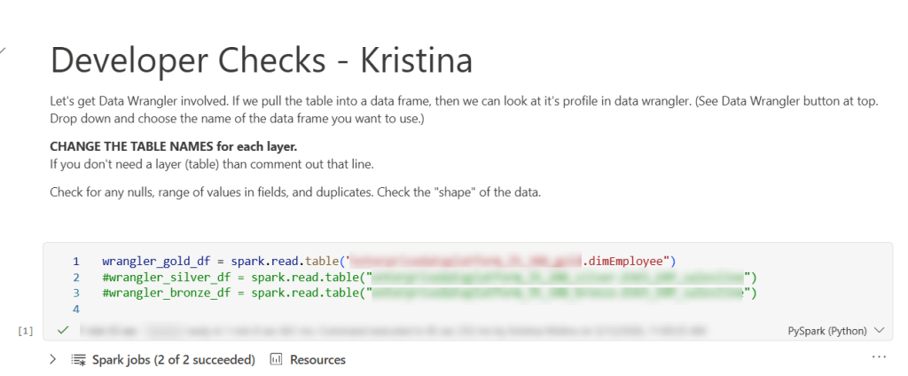
Basically, you could just have 1 line in this notebook and that would be all you need.
wrangler_gold_df = spark.read.table('lakehouseName.tableName')
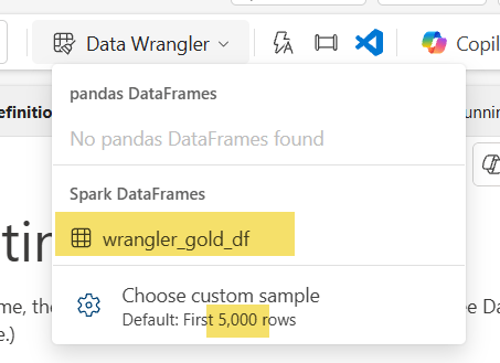
Once you have run that cell, you can enter DATA WRANGLER WORLD. Yay! All you need is to click that little button at the top and select your data frame. Special note: the default for data wrangler is the first 5,000 rows, but you can change that. For example, this particular table had a little over 15K rows so I changed it to 16000. I wouldn’t do this for something really big (dimension or fact), but for 15Kish rows, it still worked as normal on an F32 capacity.
Now we are taken to a completely different area. Since a lot of our code is logic in a spark sql view, the ability to generate code in data wrangler is not what we are really using it for in this case. I’m using it to get the shape of my data and do some quick checks. The first check I’m going to do is make sure my primary key is unique. Microsoft Fabric with lakehouses doesn’t have an identity field, so you have to progmatically find a way to do it. That can be prone to error, so my first checks are with my surrogate key: is it distinct and are there any missing values. I click on the EmployeeKey column and voila! It says I have 15,894 rows, that’s the same number as my Distinct values, and I have no missing values.
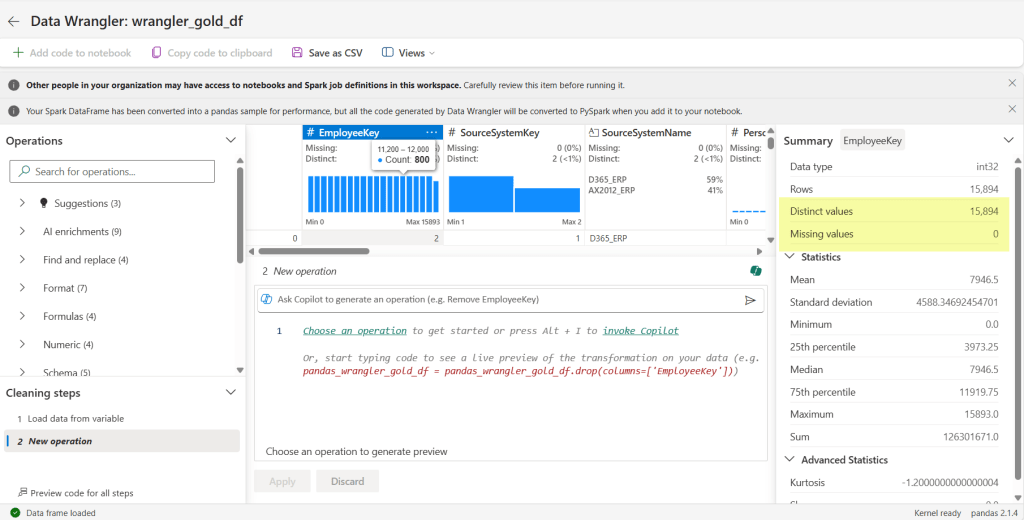
We see are all clear. Awesome-sauce.
I can see from my third field (SourceSystemName) that it only contains 2 values: D365_ERP and AX2012_ERP – which is EXACTLY the only values it should contain. Double Yay!
Scrolling along to each field, I can discover more. For the field I have selected, I can verify the data type is correct (see int32 highlighted in blue for the EmployeeKey) – something we sometimes mess up by putting in a text default when we should be using a numerical default. I can also see as I scroll through the fields that there are no missing values in my columns (see highlighted yellow area).
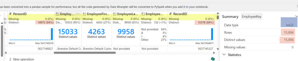
The pink highlight represents something I need to check out. Normally our RecordID is unique (recid from D365 and AX2012), but in this case it does not match the distinct values (it doesn’t even match PersonID!). That’s because we have 2 source systems and since the recid is system-generated, there is always the possibility for overlap. But don’t worry, we can still check it easily here.
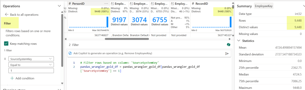
By choosing the filter Operation (under Sort and filter) on the left-hand side, I can check my counts against each source system to test my theory. Yay Again! They now match. Spoiler alert, the count matched when I changed the filter to my other source system too.
This also works in other ways. In our logic for creation/updates to this table, we had some code that didn’t account for SCD with an employees name in the source system. We don’t have a requirement to keep the history in our data warehouse, so this was making duplicates across fact tables. RecordID (aka recid) is the source system’s generated surrogate key, so when I saw that the RecordID did not match the PersonID count, I knew to go back to the code and see why (thankfully a really easy fix). By looking at some of these things first, we can hopefully avoid testers throwing bugs back to us.
Another thing you can see in data wrangler is the shape of your data. What the heck does “shape of your data” mean? It’s basically saying what it looks like and how it is distributed. Yea – maybe that still doesn’t clear things up. Let me show you:
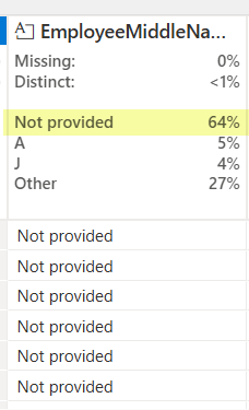
For most of our text fields in a dimension, we have a ‘Not provided’ default value. This let’s me know that 64% of our values are the default. While that may be totally expected in some columns (like EmployeeMiddleName), that’s going to send off alarm bells if I see ‘Not Provided’ ANYWHERE for my SourceSytemName field. That column should always have a valid source system name. In other columns maybe seeing the ‘Not provided’ is ok, but starts to get worrisome at some percentage. Different fields will have a different requirements, but sometime you will see things you didn’t even think of as a developer. (Mind you, maybe you SHOULD, but sometimes we don’t live in a perfect world and you can’t do every single check.)
Last but not least, one of the big checks I do, is validate that the assumption of alternate key (which was probably used in a windows function or 2 … or 3), is correct. For this I use the Operations function Group by and aggregate.
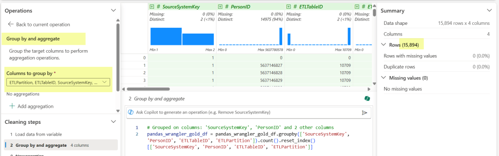
Once I select Group by and aggregate, I then select my columns that are part of the alternate key I’ve used in my code. (Those buggers end up being important when you JOIN later.) We can see my row count meets my original one against the PK, which gives me all the warm and fuzzies. Added bonus that it generates the code block and then I can see all the fields easily that I selected in the drop down.
When I’m done, I don’t bother saving the generated items from data wrangler (though I could if I wanted to.) I just click the back arrow and return to my tiny notebook.
So rather than have to type a bunch of code to do these checks (or hand hack reusable code in multiple places), I just need the table name and one line of code in a notebook:
wrangler_gold_df = spark.read.table('myawesomegoldlakehouse.dimEmployee')
That the essence of it. And it ends up saving me not only time, but visually seeing new use cases that may be particular to a field that I didn’t see before. Even better, I can copy the notebook for other people to use for their own testing. We have testers that don’t typically do anything in a notebook. If they don’t want to use other methods, then they have the option of going into their notebook and taking a peak under the covers – which is more time saved.
Do you have any different ways you use Data Wrangler? Share the knowledge for others in the comment section.
Happy Wrangling!
